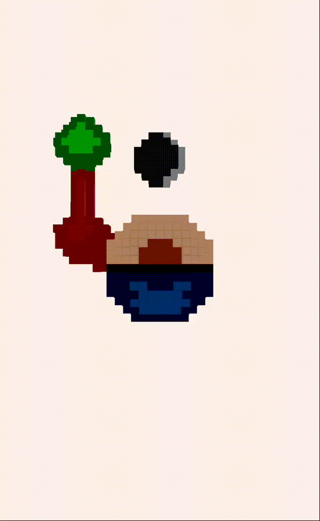
blokz logo voxel style
Spent some time today working on this bad boy for the website & eventual app.

,{^>^}, still a bit of work to get done with the finer details. Things like removing the black border and some other minor annoyances I have with this version. But it's fun going from this...
![]()
To the 3D version above.
So one thing that was immediately noticable to me is the tree seperation because of the blackspace, which I always knew was a perspective issue, but didn't handle it.
Secondly, the light source is inconsistent in the picture.. top, right, bottom left, in front, it needs to end!!!
And here I was sooo proud of the initial logo, and that's ok, "Done is better then perfect", and it was done at the time.
Edit: slightly edited version .. still alot of lighting work to be done. And making it look less perfect.. (;

The home looks more like a surface... Let's fix that.

Comments